Students often refer to Class 7 Ganita Prakash Solutions and NCERT Class 7 Maths Part 2 Chapter 5 Connecting the Dots Question Answer Solutions to verify their answers.
Class 7 Maths Ganita Prakash Part 2 Chapter 5 Solutions
Ganita Prakash Class 7 Chapter 5 Solutions Connecting the Dots
Class 7 Maths Ganita Prakash Part 2 Chapter 5 Connecting the Dots Solutions Question Answer
5.1 Of Questions and Statements (Page 98)
Question.
Which of the following are statistical questions?
(a) What is the price of a tennis ball in India?
(b) How old are the dogs that live on this street?
(c) What fraction of the students in your class like walking up a hill?
(d) Do you like reading?
(e) Approximately how many bricks are in this wall?
(f) Who was the best bowler in the match yesterday?
(g) What was the rainfall pattern in Banner last year?
Solution:
(a) Prices may vary from place to place and brand to brand. It refers to statistical data.
(b) Ages of dogs will vary. It refers to statistical data.
(c) Responses will vary among students. It refers to statistical data.
(d) This reflects only one person’s opinion. It does not refer to statistical data.
(e) It is a single fixed count with no variability. Hence, it does not refer to statistical data.
(f) It has a single factual answer. Hence, it does not refer to statistical data.
(g) Rainfall varied over time.
It refers to statistical data. Hence, the statistical questions are: (a), (b), (c), (g)
Figure it Out (Page 101)
Question 1.
Shreyas is playing with a bat and a ball—but not cricket. He counts the number of times he can bounce the ball on the bat before it falls to the ground. The data for 8 attempts is 6, 2, 9, 5, 4, 6, 3, 5. Calculate the average number of bounces of the ball that Shreyas is able to make with his bat.
Solution:
Data for Shreyas’ bounces (the ball on the bat) are: 6, 2, 9, 5,4, 6,3,5.
Sum of the data (attempts) =6+2+9+5+4+6+3+ 5=40
Number of attempts = 8
Mean (Average) =\(\frac{\text { Sum of all the values in the data }}{\text { Number of values in the data }} \)
\(=\frac{40}{8}=5\)
Thus, on average, Shreyas makes 5 bounces per attempt.
![]()
Question 2.
Try the activity above on your own. Collect data for 7 or more attempts and find the average.
Solution:
Take a bat and a ball. Count the number of bounces for each attempt. Repeat for at least 7 attempts. Add all the counts and divide the total by the number of attempts to find the mean.
Example: Data =4,5,6,6,2,7,5.
Sum of all values in the data =32
Number of values in the data (attempts) =7
Mean (Average) =\(\frac{\text { Sum of all the values in the data }}{\text { Number of values in the data }} \)
=\(\frac{35}{7}\)=5
Thus, the average number of bounces would be 5 per attempt.
Question 3.
Identify a flowering plant in your neighbourhood. Track the number of flowers that bloom every day over a week during its flowering season. What is the average number of flowers that bloomed per day?
Solution:
Do it yourself.
Question 4.
Two friends are training to run a 100 m race. Their running times over the past week are given in seconds Nikhil: 17, 18, 17, 16, 19, 17, 18; Sunil: 20, 18, 18, 17, 16, 16, 17. Who on average ran quicker?
Solution:
Nikhil’s times (in seconds): 17,18,17,16,19,17,18
Sum of running times (observations) =122 seconds
Number of observations =7
Mean(Average) =\(\frac{\text { Sum of the data values }}{\text { Number of values }}=\frac{122}{7} \)
≈ 17.43 seconds
Average (Mean) running time for Sunil is 17.43 seconds.
Hence, both Nikhil and Sunil have the same average time of 17.43 seconds.
Therefore, no one ran quicker on average.
![]()
Question 5.
The enrolment in a school during six consecutive years was as follows: 1555,1670,1750,2013,2040,2126. Find the mean enrolment in the school during this period.
Solution:
Enrolments in a school during six consecutive years:
1555,1670,1750,2013,2040,2126 .
Sum of all observations (enrolments) =11,154
Number of observations (years) =6
Mean (Average) =\(\frac{\text { Sum of the data values }}{\text { Number of values }}\)
=\(\frac{11154}{6}\)=1859
Thus, the mean enrolment over six years is 1,859 students.
Know Your Onions! (Pages 103-104)
Question.
Does this visualisation capture all the data presented in the tables earlier?
Solution:
This visualisation (dot plot) does not capture all the data presented in the tables earlier (page 102), as it contains only the prices of onions but does not represent the month-wise price of onions.
Question.
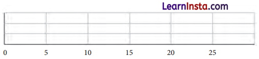
Find the average price of onions at Yahapur and Wahapur.
Solution:
At Yahapur:
The sum of onion prices in 12 months of a year per kg
= 25 + 24 + 26 + 28 + 30 + 35 + 39 + 43 + 49 + 56 + 59+ 44 = 458
Average price of onions =\(\frac{450}{12}\)=38.17
Thus, the average price at Yahapur =₹ 38.17 per kg
At Wahapur:

The sum of onion prices in 12 months of a year per kg
=19+17+23+30+38+35+42+39+53+60+52 +42=450
Average price of onions =\(\frac{450}{12}=37.5\)
Thus, the average price at Wahapur =₹ 37.50 per kg.
![]()
Question.
What else do you wonder about?
Solution:
Do it yourself
Outliers and Medians
Height of a Family (Page 107)
Question.
Find the mean and median in Poovizhi’s data without the outlier value 118. What change do you notice?
Solution:
The heights of Poovizhi’s family members are as follows:
170 cm, 173 cm, 165 cm, 118 cm, 175 cm.
Mean (Average) height =\(\frac{\text { Sum of the data values }}{\text { Number of values }}=\frac{118+165+170+173+175}{5}=\frac{801}{5}\)=160.2 cm
Now, to find the median arrange the data in ascending order: 118, 165, 170, 173, 175
Since, the number of values, n=5 (odd).
So, median of the data will be the value of middle term, i.e., third term, i.e., 170.
So, the median is 170 cm.
Now, remove the Outlier (118 cm).
Remaining heights: 170 cm, 173 cm, 165 cm, 175 cm
Mean (Average ) height =\(\frac{\text { Sum of the data values }}{\text { Number of values }}\) =\( \frac{170+173+165+175}{4}=\frac{683}{4}\) = 170.75 cm
Now, to find the median arrange the data in ascending order: 165,170,173,175
Since, number of values, n=4 (even).
So, median of the data will be the average of middle two terms.
Therefore, median =\(\frac{170+173}{2}=\frac{343}{2}\)=171.5 cm
Dot plot representation:
Nican and Median with outlier:

Mean and Median without outlier:

Comparison with Original Data:
| Measure | With Outlier 118 cm | Without Outlier 118 cm |
| Mean | 160.2 cm | 170.75 cm |
| Median | 170 cm | 171.5 cm |
Thus, we notice that:
- Removing the outlier (118 cm) increases the mean significantly (from 160.2 cm →170.75 cm).
- The median changes only slightly (from 170 cm → 171.5 cm).
This shows that the mean is more affected by extreme values (outliers), while the median remains more stable and represents the data more reliably.
Are you a bookworm? (Pages 107-108)
Question.
After the summer vacation, a class teacher asked his class how many short stories they had read. Each student answered the number of stories read on a piece of paper, as shown below. Find the mean and median number of short stories read. Before calculating them, can you guess whether the mean will be less than or greater than the median?

Mark the data, the mean, and the median on the dot plot below.
Solution:
The data collected for reading storybooks were as follows: 0,0,1,2,3,5,5,6,7,8,8,10,12,15,40
Observing the data, we can see that the outlier is 40 to the right.
That indicates the mean of the data is greater than the median.
Mean and Median (with all values):
Mean =\(\frac{\text { Sum of the data values }}{\text { Number of values }}\)
=\(\frac{0+0+1+2+3+5+5+6+7+8+8+10+12+15+40}{15}=\frac{122}{15}\)=8.13
Number of values in data =15 (odd)
So, median =Value of the middle term in the data, i.e., value of the 8th term =6.
It is clear that mean (8.13) is greater than the median (6).
![]()
Dot plot representation:

Question.
Which of the values would you consider an outlier?
Solution:
The value 40 is an outlier because it is much larger than the rest of the data.
Question.
Find the mean and median in the absence of the outlier. What change do you notice?
Solution:
New data without outlier (40): 0,0,1,2,3,5,5,6,7,8,8,10,12,15
New mean (without outlier) =\(\frac{\text { Sum of all data values }}{\text { Number of data values }}\)=\(\frac{0+0+1+2+3+5+5+6+7+8+8+10+12+15}{14}=\frac{82}{14}\)=5.86
Since, the number of data values after removing the outlier =14(even)
New median = average of middle terms 7th and 8th values =\(\frac{5+6}{2}=\frac{11}{2}\)=5.5
Thus, new mean =5.86 and new median =5.5
Thus, we notice that:
- Removing the outlier (40) significantly decreases the mean (from 8.13 →5.86)
- The median changes only slightly (from 6 → 5.5)
This shows that the mean is more affected by outliers, while the median remains a more reliable measure of central tendency when extreme values are present.
Are We on the Same Page? (Pages 108-109)
Do you read … same or different?
The list below shows the number of pages for a particular newspaper from Monday to Sunday:
16,18,20,22,26,16,10
Mark the data, the mean, and the median on the dot plot below.
Solution:
Data for the number of pages for a particular newspaper from Monday to Sunday:
10, 16, 16, 18, 20, 22, 26
Mean =\(\frac{\text { Sum of all data values }}{\text { Number of data values }}\)
=\(\frac{10+16+16+18+20+22+26}{7}=\frac{128}{7}\)=18.29
Since the number of data values =7 (odd).
So, median = value of 4th term =18.
Thus, median =18
Dot plot representation:

Thus, the mean (18.29) and the median (18) are quite close, which means the data is fairly symmetrical. There are no extreme outliers affecting the distribution significantly.
Question.
Discuss the effect on the mean and median when outliers are present on both sides. You may take some example data to examine and explain this.
Solution:
Assume data for five friends’ pocket money (in ₹) as follows: 40, 45, 50, 55, 60
Mean = 50, Median = 50
Now, let us see how adding outliers on both ends affects the mean and the median in different cases.
Case A: When we add ₹10 (low outlier) and ₹ 90 (high outlier).
New data: 10, 40, 45, 50, 55, 60, 90
New mean: 50,
New median: 50
In this case the outlier balance each other out, with no shift in the centre.
![]()
Case B: Let us add HO (low outlier) and ₹ 500 (high outlier)
New data: 10, 40, 45, 50, 55, 60, 500
New mean: 108.60 (approximately)
New median: 50
Here, we see that the high outlier is much more extreme than the low outlier, the mean is pulled sharply to the right while the median stays unchanged.
Case C: Let us add ₹ 1 (low outlier) and ₹ 80 (high outlier)
New data: 1, 40, 45, 50, 55, 60, 80
New mean: 47.30 (approximately)
New median: 50
The mean drops because the high outlier is much more extreme than the high outlier.
Again the median remains the same unaffected by the outliers.
Thus, we can conclude that median always remains the same although we have outliers on both ends.
However, the mean can shift dramatically, showing how sensitive is to extreme values on either end.
Of Ends and the Essence
How Tall is Your Class? (Pages 109-110)
Suppose you are asked … for each collection.
How many students are taller than the class average height?
Solution:
The class average height (mean) is 144.4 cm (from the whole class plot).
Looking at the dot plot for the whole class:
The students taller than 144.4 cm are those plotted to the right of this value.
By counting the dots to the right of 144.4 cm,
we can identify how many students exceed this height.
After analysing the plot, 15 students are taller than the class average height.
Question.
How many boys are taller than the class average height?
Solution:
Class average height (mean) is 144.4 cm (from the whole class plot).
Looking at the dot plot for the boys:
The boys taller than 144.4 cm are those plotted to the right of this value.
Counting the dots to the right of 144.4 cm, we get the number of boys taller than the average.
After analysing the plot, 8 boys are taller than the class’s average height.
How long is a minute? (Page 110)
Two groups … their eyes.
Question.
Discuss how well both the groups fared at this activity. Describe and compare the variability in data and their central tendency.

Solution:
Group A: Mean = 58.21 and Median = 60
Variability: The data points for Group A are more spread out, ranging from 42 to 68.
There is more spread (variability) in Group A’s data, as shown by the wider distribution of dots along the range. Some values are clustered around 60, but others are both lower and higher, creating a larger spread.
Group B: Mean = 59.28 and
Median = 59.5
Variability: The data points for Group B are more tightly packed, with most values between 55 and 65.
There is less variability in Group B’s data.
The data points are concentrated around the mean, and fewer values appear at the extremes (lower or higher), indicating a smaller spread.
Comparison: Both Group A and Group B have similar mean values, with Group B being slightly higher (59.28) than Group A (58.21). However, Group B’s median (59.5) is also closer to its mean, while Group A’s median (60) is higher than its mean, suggesting a slight shift of the mean towards lower value in Group A.
Hence, group A’s performance shows greater variability, meaning there is more difference in how well the students did, with some doing much better and some doing much worse.
Group B’s performance is more consistent, with less variability and more students performing similarly around the average.
![]()
Figure it Out (Pages 112-113)
Question 1.
Find the median of onion prices in Yahapur and Wahapur.
Solution:
To find the median, first list the data in increasing order. The median is the middle value in the ordered list.
For Yahapur: Arranging the monthly onion prices in increasing order: 24,25,26,28,30,35,39,43,44,49, 56, 59
Number of values =12 (even)
So, the median of the value will be the average of middle terms 6th and 7th.
Therefore, median =\(\frac{35+39}{2}=\frac{74}{2}\)=37
Thus, the median onion price of Yahapur is ₹37.
For Wahapur:
Arranging the monthly onion prices in increasing order:
17,19,23,30,35,38,39,42,42,52, 53, 60
So, the median of the value will be the average of middle terms 6th and 7th.
Therefore, median =\(\frac{38+39}{2}\)=\(\frac{77}{2}\)=38.5
Thus, the median onion price of Wahapur is ₹ 38.5
Question 2.
Sanskruti asked her class how many domestic animals and pets each had at home. Some of the students were absent. The data values are 0,1,0,4,8,0,0,2,1,1,5,3, 4,0,0,-10,25,2,-2,4. Find the mean and median. How would you describe this data?
Solution:
Data for the domestic animals and pets each had at home (excluding missing values):
0,1,0,4,8,0,0,2,1,1,5,3,4,0,0,10,25,2,2,4
Arranging the data in increasing order,
we have: 0,0,0, 0,0,0,1,1,1,2,2,2,3,4,4,4,5,8,10,25
Since, the number of values =20 (even), so the median is the average value of middle two terms,
i.e., 10th and 11th. Thus, median =\(\frac{2+2}{2}=\frac{4}{2}\)=2.
Sum of data values =0+1+0+4+8+0+0+2+1+
1+5+3+4+0+0+10+25+2+2+4=72
Number of values =20.
Mean =\(\frac{\text { Sum of all data values }}{\text { Number of data values }}=\frac{72}{20}\)=3.6
The mean is greater than median that indicates the data have a few high values (10 and 25) significantly higher than most of the data points. The values pulled the average up.
![]()
Question 3.
Rintu takes care of a date-palm tree farm in Habra. The heights of the trees (in feet) in his farm are given as: 50, 45,43,52,61,63,46,55,60,55,59,56,56,49,54,65, 66,51,44,58,60,54,52,57,61,62,60,60,67. Fill the dot plot, and mark the mean and median. How would you describe the heights of these palm trees? Can you think of quicker ways to find the mean? How many trees are shorter than the average height?
Solution:
Data values of the heights of the trees (in feet) in Rintu’s farm are given as:
50,45,43,52,61,63,46,55,60,55,59,56,56,49,54,
65,66,51,44,58,60,54,52,57,61,62,60,60,67 .
Arranging the data values in increasing order, we have:
43,44,45,46,49,50,51,52,52,54,54,55,55,56,56,
57,58,59,60,60,60,60,61,61,62,63,65,66,67 .
Number of data values =29 (odd),
so the median is the value of middle term in the data, i.e., value of the 15th term, which is 56 .
Thus, median height of palm trees is 56
Sum of data values =50+45+43+52+61+63+46 +55+60+55+59+56+56+49+54+65+66+51 +44+58+60+54+52+57+61+62+60+60+67
=1621
Mean height of palm trees =\(\frac{\text { Sum of all data values }}{\text { Number of values }} \)
=\(\frac{1621}{29}\)=55.89
Dot plot representation:

The mean height is around 55.9 feet, and the median is 56 feet. The data is relatively evenly distributed with a few higher values, but there is no extreme outlier. Quicker ways to find the mean: We could use grouping to simplify the summing process or find the midpoint of the data to estimate the mean quickly.
From the data values set, trees with height less than 54.9 feet are: 43, 44,45,46, 49, 50, 51, 52, 52, 54, 54, 55 (12 trees). Hence, 13 trees are shorter than the average height.
The daily water usage from a tap was measured. The usage in litres for the first few days are:
5.6, 8,3.09,12.9, 6.5, 12.1, 11.3,20.5,7.4.
(a) Can the mean or median daily usage lie between 25 and 30? Justify your claim using the meaning of mean and median.
(b) Can the mean or median be less than the minimum value or greater than the maximum value in a data set?
Solution:
(a) The usage in litres for the first few days are: 5.6, 8, 3.09, 12.9, 6.5, 12.1, 11.3,20.5, 7.4
Sum of the data values = 5.6 + 8 + 3.09 + 12.9 + 6.5 + 12.1 + 11.3 + 20.5 + 7.4 = 87.39
Number of values = 9
Therefore, mean =\(\frac{\text { Sum of all data values }}{\text { Number of values }} \)
=\(\frac{87.39}{9}\)=9.71
Now, arranging the data values in increasing order,
we have: 3.09, 5.6, 6.5,7.4, 8, 11.3,12.1, 12.9,20.5.
Since, the number of data values = 9 (odd)
So, median = value of the middle term in the data,
i. e., value of 5th term = 8.
Clearly, the mean and median of daily uses of water cannot lie between 25 and 30. They are both well below this range.
(b) No, the mean and median cannot be lesser than the minimum value or greater than the maximum value in the data. The mean is influenced by all values, but it will always be between the minimum and maximum. Similarly, the median is always between the two middle values.
![]()
Question 5.
The weights of a few newborn babies are given in kgs. Fill the dot plot provided below. Analyse and compare this data.
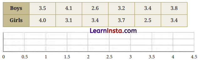
Solution:
Mean of Newborn babies (boys):
\(\frac{3.5+4.1+2.6+3.2+3.4+3.8}{6}=\frac{20.6}{6}\)=3.43
Median of Newborn babies (boys):
Arrange the data value in increasing order: 2.6,3.2,3.4, 3.5, 3.8, 4.1
Number of data values =6 (even)
So, median of newborn babies (boys) = average of middle two data numbers values,
i.e., 3rd and 4th data number
=\(\frac{3.4+3.5}{2}=\frac{6.9}{2}\)=3.45
Mean of Newborn babies (girls):
\(\frac{4.0+3.1+3.4+3.7+2.5+3.4}{6}=\frac{20.1}{6}\)=3.35
Median of Newborn babies (girls):
Arrange the data value in increasing order: 2.5,3.1,3.4,3.4,3.7,4.0.
Number of data values =6 (even)
So, median of newborn babies (girls) = average of middle two data numbers values, i.e., 3rd and 4th data number =\(\frac{3.4+3.4}{2}=\frac{6.8}{2}\)=3.4
Dot plot representation:

Analysis and Comparison
- Boy’s mean and median (i.e., 3.43 kg and 3.45 kg) are slightly higher than girls’ mean and median (i.e., 3.35 kg and 3.4 kg).
- Boy’s weight are more evenly spread, while girls have two babies at 3.4 kg, showing a small cluster.
Question 6.
The dot plots of heights of another section of Grade 5 students of the same school are shown below. Can you share your observations? What can we infer from the dot plots and the central tendency measures?

Solution:
For whole class: The heights are spread between 128 cm and 158 cm. Most students heights cluster between 140 cm and 150 cm. A few students are much shorter (around 125-130 cm) and a few taller (around 155 cm), indicating some variation.
For boys: Their heights range approximately from 130 cm to 148 cm. The majority of boys’ heights are between 140 cm and 148 cm, showing a moderate spread. The dot plot appears slightly right-skewed, meaning more boys are a little taller.
For girls: Their heights range from about 126 cm to 158 cm, showing a wider spread than the boys.
The distribution appears more evenly spread but with a few tall girls (around 150-155 cm) and short ones (around 125-130 cm).
Inference: Boys are slightly taller on average (mean = 142.05 cm) than girls (mean = 140.14 cm).
Boys’ median (143 cm) > girls’ median (140 cm) showing boys tend to be taller overall. The spread of girls’ heights seems wider, suggesting more variation among girls’ heights compared to boys’.
Hence, the overall class mean (141.21 cm) lies between the boys’ and girls’ means, which is expected since it includes both groups.
![]()
Question.
Compare the heights of the two sections. Share your observations.
Solution:
- Uniformity: The bars in Section A appear more uniform in height, suggesting a more consistent or concentrated dataset.
- Skewness: Section B shows a clear, sharp increase in height (steep incline) compared to the more gradual increase in Section A.
- Difference: The maximum height in Section B is significantly higher than the maximum height in Section A, indicating a greater range of values in the second section.
Question 7.
The weights of some sumo wrestlers and ballet dancers are: Sumo wrestlers: 295.2 kg, 250.7 kg, 234.1 kg, 221.0 kg, 200.9 kg. Ballet dancers: 40.3 kg, 37.6 kg, 38.8 kg, 45.5. kg, 44.1 kg, 48.2 kg. Approximately how many times heavier is a sumo wrestler compared to a ballet dancer?
Solution:
We are given the weights of sumo wrestlers and ballet dancers.
Sumo wrestlers: 295.2 kg, 250.7 kg, 234.1 kg, 221.0 kg, 200.9 kg
Ballet dancers: 40.3 kg, 37.6 kg, 38.8 kg, 45.5 kg, 44.1 kg, 48.2 kg
We need to find approximately how many times heavier a sumo wrestler is compared to a ballet dancer.
Sumo wrestlers average weight:
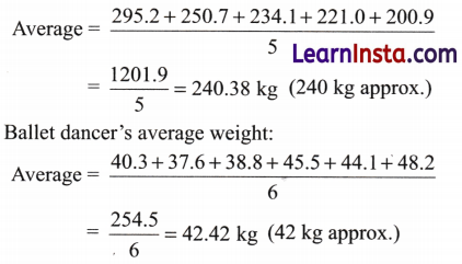
Now we find how many times heavier the average sumo wrestler is compared to the average ballet dancer:
\(\frac{240}{42}\) ≈ 5.7
So, a sumo wrestler is approximately 6 times heavier than a ballet dancer.
Obswervation:
- Sumo wrestlers have a very high body mass due to their muscle and fat composition, which is essential for their sport.
- Ballet dancers maintain a low body weight to ensure agility, grace, and balance.
- The difference in their average weights (around 240 kg vs 42 kg) shows how different physical requirements exist for these two activities.
- Visually, on a balance scale (like the one shown in the image), a sumo wrestler would heavily outweigh four ballet dancers combined.
5.3 Visualising Data
Clubbing the Columns (Page 115)
Question.
What is the scale used in this graph?

Solution:
Since, the relative heights of the bars represent onion prices in Yahapur and Wahapur respectively by taking a suitable scale.
The scale of the graph on the vertical line for onion prices is: 2 units length =₹ 10.
On horizontal line we have months of the year.
Is it now easier to compare month-wise prices in both places?
Sol. Yes, it is easier to compare the month-wise onion prices in both Yahapur and Wahapur from the given bar chart. The chart uses two distinct patterns of bars for the two places (Yahapur with blue diagonal stripes and Wahapur with red dotted lines), making it visually clear to compare the prices for each month side by side.
10 …. 9….8….7….6….5 ….4….3….2….1…. Take Off!
(Page 118)
Identify which of the following statements can be justified using this data.
(a) All organisations launched more rockets than the previous years.
(b) Only an organisation from the USA launched more than 50 rockets in a single year.
(c) The total number of rockets launched by France in all 3 years is less than 40.
(d) The average number of rockets launched by CASC in these 3 years is around 40.
(e) ISRO launched more rockets than Galactic Energy in these 3 years.
(f) Russia launched more than 60 rockets in these 3 years.
Solution:
(a) No. The data shows that some organisations like SpaceX, ISRO and Galactic Energy launched more rockets compared to the previous years, but others launched fewer rockets (for example, United Launch Alliance).
(b) Yes. SpaceX, an organisation from the USA launched more than 50 rockets in 2022 and 2023.
(c) Yes. The data indicates that France’s (Arianespace) total number of rocket launches over the three years are fewer than 40.
(d) Yes. The total number of rocket launches by CASC is around 120-130 over the 3 years. Hence, the average number of rockets launched by CASC in these 3 years is more than 40, not around 40.
(e) Yes. The number of rockets launched by ISRO is higher than Galactic Energy in these 3 years.
f) No. Russia did not launched more than 60 rockets in total over these 3 years.
![]()
Question.
List the organisations that have consistently launched more rockets every year.
Solution:
The organisations that have consistently launched more rockets every year are: SpaceX, Galactic Energy, and ISRO. They have consistently launched more rockets over the three years.
Question.
Estimate the total number of rockets launched worldwide in 2023.
(a) less than 200
(b) 200 to 400
(c) 400 to 600
(d) more than 600
Solution:
(b) Based on the data, the estimate for the total number of rockets launched in 2023 is 200 to 400.
All it Takes is a Minute
(Pages 121-122)
Have you ever missed watching a cricket match? You can catch up in a minute by looking at a graph. You might have seen graphs like the following one.

Question 1.
Can we tell who batted first? Who won the match?
Solution:
From the graph, we cannot directly tell who batted first. However, we can see the runs scored by each team over the 20 overs. The red team scored more consistently in most overs, indicating they might have won the match, but we cannot definitively say based on the graph alone. We can just assume that the blue team batted first and red team won the match.
Question 2.
How many runs did the blue team score in over 12?
Solution:
The blue team scored 15 runs in over 12.
Question 3.
In which over did the red team score the least number of runs?
Solution:
The red team scored the least number of runs in overs 19 and 20, where they made 0 runs (indicated by a wicket symbol).
Question 4.
Is it easy to tell the target set by the team batting first?
Solution:
No, it is not easy to tell the target set by the team batting first just by looking at the graph. This graph only shows the runs scored per over without providing the total score or specify which team batted first.
Figure it Out (Pages 122-125)
Question 1.
The following infographic shows the speeds of a few animals in air, on land, and in water. Can we call this graph a bar graph?
(For infographic refer to page 123 of NCERT Textbook)
(a) What is the scale used in this graph?
(b) What did you find interesting in this infographic? What do you want to explore further?
(c) Identify a pair of creatures where one’s speed is about twice that of the other.
(d) Can we say that a sailfish is about 4 times faster than a humpback whale? Can we say that a sailfish is the fastest aquatic animal in the world?
Solution:
(a) The graph represents the speed in kilometers per hour (kph). Each bar represents the speed of a different animal in air, on land, or in water. The scale is 1 unit length =16 kph.
(b) The most interesting part of this infographic is the speed of the peregrine falcon (322 kph) and the spine tailed swift (170 kph) as these speeds are significantly higher than other animals. I would like to explore how these animals achieve such high speeds and how their bodies are adapted for such fast movement.
![]()
(c) A good example is the comparison between the peregrine falcon (322 kph) and the spine-tailed swift (170 kph). The falcon’s speed is roughly twice the speed of the tailed swift.
(d) Yes, a sailfish (109 kph) is about 4 times faster than a humpback whale (26 kph). However, while the sailfish is extremely fast, it is not necessarily the fastest aquatic animal in the world.
Question 2.
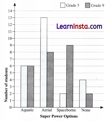
Preyashi asked her students ‘If you were to get a super power to become aquatic (water-borne), aerial (air borne), or spacebome, which one would you choose?’ The responses are shown below. Some chose none. Draw a double-bar graph comparing how both grades chose each option. Choose an appropriate scale.

Answer:
To draw the double-bar graph, the horizontal line will represent the super power options [water-borne (w), aerial (a), space borne (s), and none (n)], and the vertical line will represent the number of students.
Scale 1 unit = 1 student.
Question 3.
The temperature variation over two days in different months in Jodhpur, Rajasthan, is given below. Draw a double-bar graph. Use the scale 1 unit = 4°C. Can you guess which two months these days might belong to?

Answer:
Using the scale 1 unit =4°C, we can plot the temperatures for each day. The months corresponding to these temperatures are:
Day 1: Likely early spring or spring (February or March)
Day 2: A peak summer day (May or June).

Question 4.
The following clustered-bar graph shows the number of electric vehicles registered in some states every year from 2022 to 2024.
Solution:

(a) The data (rounded-off to thousands) for the states of Gujarat and Delhi are given in the table below. Mark the corresponding bars on the bar graph. (It is enough if you place the top of the bars between the two appropriate vertical guidelines.)

(b) Notice how the graph is organised, what scale is used, and what patterns the data shows.
(c) How would you describe the change for various states between 2022 and 2024?
(d) Approximately how many more registrations did Assam get in 2023 compared to 2022?
(e) How many times more did the registrations in West Bengal increase from 2022 to 2024?
(f) Is this statement correct ‘There were very few pew registrations in Uttarakhand in 2023 and 2024, as the increase in the bar lengths is minimal’?
Solution:
(a)
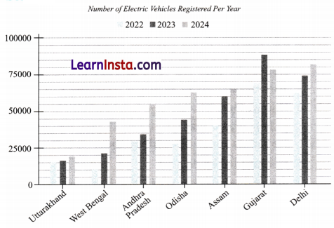
(b) The bar graph shows clustered bars for each state (Uttarakhand, West Bengal, Andhra Pradesh, Odisha, Assam, Gujarat, and Delhi) for each year from 2022 to 2024 along the horizontal line.
The vertical line represents the number of electric vehicles, with the scale in increments of 25,000 vehicles, ranging from 0 to 1,00,000.
Patterns: Most states show an increase in the number of electric vehicles registered each year. Gujarat and Delhi have higher registrations in comparison to other states. Uttarakhand has the lowest bar, showing fewer registrations across all three years.
(c) Gujarat: The number of registrations increased from 69,000 in 2022 to 78,000 in 2024.
Delhi: Registrations increased from 62,000 in 2022 to 81,000 in 2024.
Uttarakhand: There is a small increase in registrations from 2022 to 2024, but it remains the lowest among the states shown.
Assam: Assam shows a significant increase over the three years.
Other States (West Bengal, Andhra Pradesh, Odisha): The trend for most states show gradual increases in electric vehicle registrations.
![]()
(d) Assam: Registrations in 2023 approximately 60,000, compared to 40,000 in 2022.
Difference: 60,000 – 40,000 = 20,000 more registrations in Assam in 2023 than in 2022.
(e) West Bengal: 2022 had around 11,000 registrations, and 2024 had around 43,000 registrations. Multiplication factor: 43,000 = 11,000 = 3.91 times more registrations in West Bengal from 2022 to 2024.
(f) Analysis: Registrations in Uttarakhand show a small increase, but not very dramatic. The bars for 2023 and 2024 are slightly higher than the 2022 bar, but they remain at the lower end of the scale compared to other states. Therefore, the statement is correct.
5.4 Data Detective
Telling Tall Tales (Pages 125-126)
Following are the dot plots of heights of boys (in blue) and girls (in orange) of Grades 6, 7, and 8 (in that order) of two different schools. What do you notice? Share your observations.
(For dot plots, refer to NCERT Textbook Page 126)
Solution:
School A:
Grade 6:
Boys: The height distribution is very narrow, with most of the data points close to the mean ( 134.8 cm ).
Girls: The heights of girls are distributed in a small range, slightly above the boys’ average, with a mean of 137.78 cm.
Grade 7:
Boys: The distribution of boys’ heights is wider, with a mean of 141.8 cm.
Girls: Girls’ heights are also spread out more than in Grade 6, with a mean of 141.83 cm.
Grade 8:
Boys: Boys’ heights in this grade show a wider spread, with some outliers at both the low and high ends of the scale, with a mean of 149.35 cm.
Girls: The girls in Grade 8 have a somewhat similar distribution, but there is a notable concentration around the 160 cm mark (mean: 147.81 cm ).
School B:
Grade 6:
Boys: Boys’ heights are more varied in School B compared to School A, with a mean of 149.84 cm.
Girls: Girls’ heights in Grade 6 are more concentrated around the middle, with a mean of 150.2 cm.
Grade 7:
Boys: The distribution of boys’ heights in Grade 7 has a larger spread compared to School A, with a mean of 156.14 cm.
Girls: The girls’ heights in this grade show a more even distribution, with a mean of 155.41 cm.
Grade 8:
Boys: Boys’ heights in this grade have the widest spread, indicating greater variation with a mean of 156.14 cm.
Girls: The girls’ in grade have a similar spread of heights, with the average being slightly higher with a mean of 156.83 cm.
(Pages 126-128)
Let us look at … shows girls’ heights.
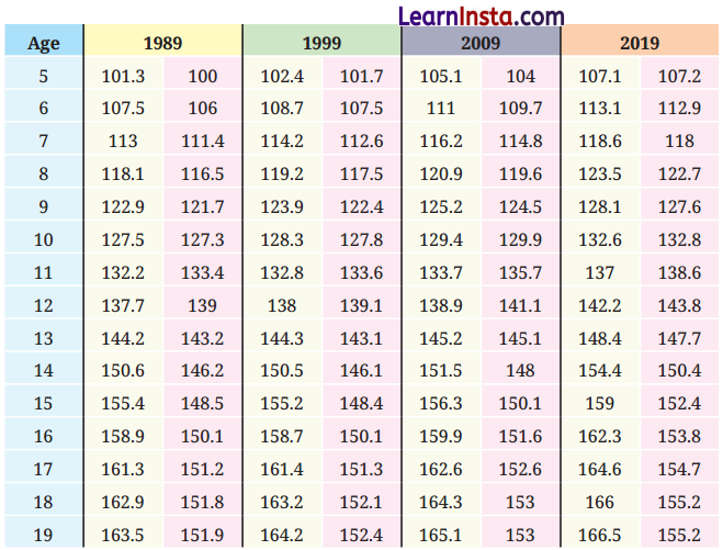
Spend sufficient time … you to probe—
- Changes in the heights of boys or girls of a certain age from 1989 to 2019.
- The heights of boys vs. girls at different ages in a particular year.
- Changes in height between successive ages in boys and girls in 2019.
Solution:
- The average heights of both boys and girls mostly increase over time in all age groups from 1989 to 2019. Boys mostly grow taller than girls at every age in the given data.
- The data mostly shows that boys are taller than girls at every age from 5 to 19 in all four years.
- In 2019, the increase in height from one age to the next is more prominent for boys compared to girls, especially after age 12. For example, boys in 19 years (166.5 cm) are significantly taller than boys at age 18 (166 cm).
Question.
Which of the following statements can be justified using the data.
1. The average heights of both boys and girls at every age increased from 1989 to 2019.
2. The average height of 13-year-old girls in 1989 is more than the average height of 14-year-old girls in 2009.
3. The average height of 15-year-old boys in 2019 is more than the average height of 16-year-old boys in 1989.
4. All girls aged 13 are taller than all girls aged 11.
5. Throughout the age period 5 to 19, the average boy’s height is more than the average girl’s height.
6. Boys keep growing even beyond age 19.
Solution:
1. True. From the data, we see a clear increase in the average heights of both boys and girls for all ages over the 30-year period.
2. False. 13-year-old girl’s height in 1989 is 143.2 cm. 14-year-old girls’ height in 2009 is 148 cm.
Hence, the height of 13-year-old girls in 1989 (143.2 cm) is indeed less than that of 14-year-old girls in 2009 (148 cm), making the statement false.
3. True. The average height of 15-year-old boys in 2019 is 159 cm.The average height of 16-year-old boys in 1989 is 158.9 cm.Hence, 15-year-old boys in 2019 are taller than 16-year-old boys in 1989.
4. Not justified. The average height of all 13-year-old girls is higher than that of all 11-year-old girls but we cannot conclude anything about all individuals.
5. Not justified by data. For example, age 5, year 2019: boy’s age (107.1) < girl’s age (107.2).
6. Not Justified by the data. The data shows the average height of boys up to age 19, but does not provide information for ages beyond 19. Therefore, this statement can’t be fully justified based on the provided data.
![]()
Question.
In 2019, between which two successive ages from 5 to 19 did boys grow the most? Between which two successive ages from 5 to 19 did girls grow most?
Solution:
Boys’ Growth: In 2019, the greatest growth for boys occurred between ages 12 and 13:
12- year-old boys: 142.2 cm
13- year-old boys: 148.4 cm
Growth: 148.4 – 142.2 = 6.2 cm.
Girls’ Growth: In 2019, the greatest growth for girls occurred between ages 10 and 11:
10- year-old girls: 132.8 cm
11- year-old girls: 138.6 cm
Growth: 138.6 – 132.8 = 5.8 cm.
Question.
Suppose the average height of a newborn is 50 cm. Estimate the average height of young children of ages 1 to 4.
Solution:
From the data in the given table in 2019, the average of 5 years: boy’= 107.1 cm, girls = 107.2 cm
So, average age of a 5 years old child 107.1 + 107.2 2
= \(\frac{107.1+107.2}{2}\)=107.15cm
Now, we will estimate the heights of the child considering the fact that a child growth is not linear in the first few years, starts very fast and then slows down significantly. Also, we will consider the fact that the average height of a 5-year-old child is 107.15 cm.
Therefore, we have
Age 1 estimate: 50 cm + 25 cm = 75 cm
Age 2 estimate: 75 cm + 15 cm = 90 cm
Age 3 estimate: 90 cm + 9 cm = 99 cm
Age 4 estimate: 99 + 4.5 cm = 103.5 cm (Answer may vary)
Based on the trend observed in the table, write your estimates of the heights of boys and girls for ages 5 to 19 in the year 2029.
Solution:
Do it yourself.
(Page 128)
You may want … from 1989 to 2019.
How is the graph organised? What information is presented?

Solution:
The graph is organised as follows:
Horizontal line: The countries (from Timor-Leste to Netherlands), representing data for various nations.
Vertical line: The height in cm, ranging from 145 cm to 185 cm.
Data Points:
Boys (1989): Represented by orange ‘ x ‘ markers.
Boys (2019): Represented by blue ‘x’ markers.
Girls (1989): Represented by orange Δ markers.
Girls (2019): Represented by blue Δ markers.
Question.
What do you find interesting?
Solution:
This graph provides insight into global trends in height growth and allows us to compare the growth rates across countries for boys and girls between 1989 and 2019.
From the graph, we can make the following observations:
Overall Growth: Over the span of 30 years (from 1989 to 2019), both boys’ and girls’ average heights have increased in almost all countries. The blue markers ‘x’ (2019) are generally higher than the orange markers ‘x’ (1989), indicating the rise in height over time.
Boys’ vs. Girls’ Heights: Boys’ heights (both in 1989 and 2019) are generally higher than girls’ heights in almost every country, as expected from general growth patterns.
Trends Across Countries: Netherlands has the tallest average heights for both boys and girls.
Countries like Timor-Leste, Bangladesh, and Indonesia show relatively lower average heights for both boys and girls.
Figure it Out
(Pages 129-134)
Question 1.
The dot plots below show the distribution of the number of pockets on clothing for a group of boys and for a group of girls.

Based on the dot plots, which of the following statements are true?
(a) The data varies more for the boys than for the girls.
(b) The median number of pockets for the boys is more than that for the girls.
(c) The mean number of pockets for the girls is more than that for the boys.
(d) The maximum number of pockets for boys is greater than that for girls.
Solution:
(a) False. From the dot plots, the girls’ data shows a greater spread, with more variation in the number of pockets. Most of the boys’ data is spread from 3 to 6 pockets, with some concentrated at 5 pockets, while girls show a more concentrated set around 4 pockets.
![]()
(b) True. Median
Number of pockets on clothing for a group of boys:
3,4,4,4,4,5,5,5,5,5,6,6
Number of values in data =12 (even)
Median = average of middle term 6th and 7th
=\(\frac{5+5}{2}=\frac{10}{2}\)=5
Similarly, median of number of pockets on clothing for a group of girls =4.
Thus, the median number of pockets for the boys is more than that for the girls.
(c) False. Mean of number of pockets on clothing for a group of boys
=\(\frac{3+4+4+4+4+5+5+5+5+5+6+6}{12}=\frac{56}{12}\)
=4.6
Similarly, mean of number of pockets on clothing for a group of girls
=\(\frac{0 \dot{+} 2+3+3+3+3+4+4+4+4+4+5+6}{13}\)
=\(\frac{45}{13}\)=3.46
This suggests that the boys have a higher mean, than girls.
(d) False. The boys’ dot plot has a maximum of 6 pockets, and the girls’ dot plot has a maximum of 6 pockets.
Question 2.
The following table shows the points scored by each player in four games:

Now, answer the following questions:
(a) Find the average number of points scored per game by A.
(b) To find the mean number of points scored per game by C, would you divide the total points by 3 or by 4 ? Why? What about B?
(c) Who is the best performer?
Solution:
(a) For Player A, the scores across the 4 games are:
Game 1: 14, Game 2: 16, Game 3: 10, Game 4: 10
Average =\(\frac{14+16+10+10}{4}=\frac{50}{4}\)=12.5
So, A’s average number of points scored per game is 12.5.
(b) For C , the total points scored is:
Game 1: 8, Game 2: 11, Game 3: 0 (Did not play),
Game 4: 13
Since C did not play in one game, we should divide the total points by 3 (not 4 ), as there are 3 games that were actually played.
So, C’s average =\(\frac{8+11+13}{3}=\frac{32}{3}\)=10.66 ≈ 10.67
For B, the total points scored are:
Game 1: 0, Game 2: 8, Game 3: 6, Game 4: 4
Here, all 4 games are played, so we divide by 4 .
So, B’s average =[/latex]\frac{0+8+6+4}{4}=\frac{18}{4}[/latex]=4.5
(c) Based on the averages:
A’s average =12.5, B’s average =4.5, C’s average = 10.67
Hence, player A is the best performer with the highest average score of 12.5.
Question 3.
The marks (out of 100 ) obtained by a group of students in a General Knowledge quiz are 85,76,90,85,39,48,56,95,81 and 75. Another group’s scores in the same quiz are 68,59,73,86,47,79,90,93 and 86. Compare and describe both the groups performance using mean and median.
Solution:
Group I Marks: 85,76,90,85,39,48,56,95,81,75
Group II Marks: 68, 59,73,86,47, 79,90, 93, 86
For Group I: Sum of scores =85+76+90+85+39+48+56+95+81+75=730
Mean =\(\frac{730}{10}\)=73
For Group II: Sum of scores =68+59+73+86+47+79+90+93+86=681
Mean =\(\frac{681}{9}\)=75.6
Arranging the data values of group I and II in increasing orders:
For Group I (ordered): 39, 48, 56, 75 , 76 , 81 , 85 , 85 ,90, 95
Median = average of middle terms 5th and 6th
=\(\frac{(76+81)}{2}=\frac{157}{2}\)=78.5
For Group II (Ordered): 47, 59, 68, 73, 79, 86, 86, 90, 93
Median = Value of middle term, i.e., 5 th term =79
Comparison of Performance:
Group I has a mean of 73 and group II has a mean of 75.6.
So, Group II has a higher average score than Group I.
Also, Group I has a median of 78.5 and Group II has a median of 79.
Hence, Group II has a higher median score, meaning the middle of their scores is better than the middle of Group I’s scores.
Question 4.
Consider this data collected from a survey of a colony.

Choose an appropriate scale and draw a double-bar graph.Write down your observations.
Solution:
To analyse the data, we need to draw a double-bar graph by taking a suitable scale. On vertical line I unit length 200 people.

Observations:
- Cricket is the most popular sport – both for watching (1240) and participating (620).
- The least favourite sport is Athletics, with only 250 watching and 105 participating.
- In all sports, the number of people watching is greater than those participating.
- Basketball and Swimming have nearly similar levels of participation.
- The gap between watching and participating is widest in Cricket and narrowest in Athletics.
![]()
Question 5.
Consider a group of 17 students with the following heights (in cm):
106,110,123,125,117,120,112,115, 110,120,115,115,115,109,115,101. The sports teacher wants to divide the class into two groups so that each group has an equal number of students: one group has students with height less than a particular height and the other group has students with heights greater than the particular height. Suggest a way to do this. Can you guess the age of these students based on the tabular data in the ‘Telling Tall Tales’ section?
Solution:
This problem involves dividing a group of 17 students into two groups based on their height. The teacher can use the median height or the cut-off height to divide the class so that each group has an equal number of students. The median height is a good approach here as it divides the students into two roughly equal halves.
Given heights (cm): 106,110,123,125,117,120,112, 115,110,120,115,102,115,115,109,115,101
Sort the data in ascending order: 101,102,106,109,110, 110,112,115,115,115,115,115,117,120,120,123, 125
Since, there are 17 students. So, median is the value of the middle term, i.e., 9th value, i.e., 115 cm
So, one group have students with height less than 115 cm and one group with height grater than 115 cm. Do it yourself.
Question 6.
Describe the mean and median of heights of your class. You can visualise the heights on a dot plot.
Solution:
Do it yourself.
Question 7.
There are two 7th grade sections at a school. Each section has 15 boys and 15 girls. In one section, the mean height of students is 154.2 cm. From this information, what must be true about the mean height of students in the other section?
(a) The mean height of students in the other section is 154.2 cm .
(b) The mean height of students in the other section is less than 154.2 cm .
(c) The mean height of students in the other section is more than 154.2 cm .
(d) The mean height of students in the other section cannot be determined.
Solution:
(d) For the 7th-grade sections, with 15 boys and 15 girls in each section, if the mean height in one section is 154.2 cm the mean height in the other section could be determined based on the distribution of heights. So,
(a) False. Since we only know the mean for one section, we cannot assume that the other section has the same mean without further information.
(b) False. The mean could be higher, lower, or the same depending on the height distribution.
(c) False. The mean could be higher, lower, or the same depending on the height distribution.
(d) True. We do not have enough data to calculate the exact mean for the other section without further details.
Question 8.
Standing tall in the storm.

(a) Write estimated values for the number of skyscrapers in New York, Tokyo, and London.
(b) Are the following statements valid?
(i) Only 12 cities have more skyscrapers than Mumbai.
(ii) Only 7 cities have fewer skyscrapers than Mumbai.
(iii) The tallest building in the world is in Hong Kong.
Solution:
(a) Estimated number of skyscrapers:
| City | Approximate number of skyscrapers |
| New York | About 300 |
| Tokyo | About 160 |
| London | About 40 |
(b) (i) Count the cities above Mumbai:
- Hong Kong
- Shenzhen
- New York
- Dubai
- Guangzhou
- Shanghai
- Tokyo
- Kuala Lumpur
- Chongqing
- Jakarta
- Bangkok
- Singapore
Yes, exactly 12 cities are above Mumbai.
So, the given statement is valid.
(ii) Based on the given graph, the cities below Mumbai are: Seoul, Toronto, Melbourne, Miami, Istanbul, Moscow, London, i.e., 7 cities which have fewer sky scrapers than Mumbai. So, the statement is valid. Note that the given graph is for the cities with most skyscrapers, it does not list all the cities with skyscrapers. So, there could be more cities with skyscrapers less than Mumbai that are not listed here.
(iii) The chart shows cities with most skyscrapers, not their height. Also, the tallest building in the world is in Dubai (Burj Khalifa). So, this statement is not valid.
![]()
Question 9.
Estimate and then measure the objects listed in the following table. Draw a double bar graph based on the data. How accurate were your estimates? Find the average difference between the estimated and measured values.
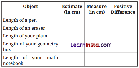
Solution:
Do it yourself.
Question 10.
Aditi likes solving puzzles. She recently started attempting the ‘Easy’ level Sudoku puzzles. The time she took (in seconds) to solve these puzzles are -410, 400, 370, 340, 360, 400, 320, 330, 310, 320, 290, 380, 280, 270, 230, 220, 240. The first nine values correspond to Week 1 and the rest to Week 2.
(a) Construct a dot plot below showing the data for both weeks.
(b) Describe the mean, median, and any observations you may have about the data.

Solution:
(a) Here is the dot plot and a concise analysis of Aditis solving times.
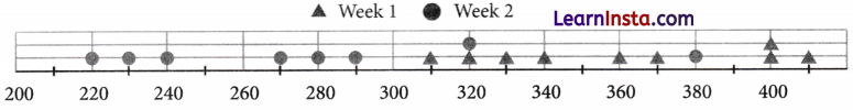
The plot above shows Week 1 as triangles and Week 2 as circles. Each dot sits at the required time in seconds.
(b)
| Set | Mean(s) | Median(s) |
| Week 1 | 360 | 360 |
| Week 2 | 278.75 | 275 |
Observations:
- Week 1 has a cluster between 310 and 410 seconds with a repeat at 400 seconds.
- Week 2 mostly lies between 220 and 320 seconds, with one noticeably high value at 380 seconds that looks like an outlier compared with the rest of that week.
- Both mean and median dropped from Week 1 to Week 2.
- Aditi’s, Week 2 shows greater consistency and faster performance.
Question 11.
Individual Project: Pick at least one of the following:
(a) How Long is a Sentence? Pick any two textbooks from different subjects. Choose any page with a lot of text from each book.
(i) Use a dot plot to describe how many words the sentences have on each page.
(ii) Compare the data of both the pages using mean and median.
(b) What is in a Name? Write down the names of all of your classmates. The following are some interesting things you can do with this data!
(i) Find the mean and median name length (number of letters in a name).
(ii) Visualise the data and describe its variability and central tendency.
(iii) Which starting letters are more popular? Which are less popular?
(iv) What is the median starting letter? What does this say about the number of names starting with the letters A-M and N-Z ?
(v) Plot a double-bar graph showing the number of boys’ names and girls’ names that:
- start and end with vowels,
- start with vowels and end with consonants,
- start with consonants and end with vowels,
- start and end with consonants.
Solution:
Do it yourself.
Question 12.
Individual project (long term): This requires collecting data over 2 weeks or more.
In and Out: Track how many times you step out of your house in a day. Do this for a month.
(i) Describe the variability and central tendency of this data. Make a dot plot.
(ii) Do you find anything interesting about this data? Share your observations.
(iii) You can ask any of your family members or friends to do this as well.
Solution:
Do it yourself.
![]()
Question 13.
Small-group project: Pick at least one of the following. Make groups of 8 to 10. Collect data individually as needed. Put together everyone’s data and do the appropriate analysis and visualisation.
(a) Our heights vs. our family’s heights: Collect the heights of your family members.
(i) Make a dot plot showing heights of just your family members. Describe its variability and central tendency.
(ii) Make a double-bar graph showing each student’s height next to their family’s mean height.
(iii) Look at everyone’s data and share your observations.
(b) Estimating time: Check the time and close your eyes. Open them when you think 1 minute has passed (no counting). Note down after how many seconds you opened your eyes. Collect this data for yourself and for your family members. Repeat this activity to estimate 3 minutes.
(i) Make two dot plots (for 1 minute and 3 minutes) showing estimates of just your family members.
(ii) Mark these on the respective dot plots. Describe its variability and central tendency.
(iii) Make a double bar graph showing each family’s mean 1 minute estimate and mean 3 minute estimate.
(iv) Look at everyone’s data and share your observations.
Solution:
Do it yourself.