Experts have designed these Class 8 Maths Notes and Part 2 Chapter 5 Tales by Dots and Lines Class 8 Notes for effective learning.
Class 8 Maths Chapter 5 Tales by Dots and Lines Notes
Class 8 Tales by Dots and Lines Notes
This chapter explores the concepts of mean and median as measures of central tendency, demonstrating how they behave when data is added, removed or modified. It also introduces line graphs as a tool for visualising trends and changes over time, along with the use of spreadsheets to efficiently calculate and manage large sets of data.
Data Handling and Measure of Central Tendencies
Data
- Data means information in the form of numbers, facts or measurements.
- When data is properly arranged and studied, it helps us to understand situations and make decisions.
e.g. Marks obtained by students in a test, number of students in a class, daily temperature of a city.
Types of data
- Primary Data Primary data is the data collected directly by a person for a specific purpose.
e.g. Asking students their favourite sport, measuring the heights of students in your class. This data is original and collected first-hand. - Secondary Data Secondary data is the data that is already collected by someone else and then used by us.
e.g. Data from newspapers, magazines or websites, records from schools, hospitals or government offices.
Collecting and Organising Data
- Collecting Data Means gathering information for a particular purpose. Before collecting data, we need to know what we would use it for.
- Organisation of Data After collecting data, it must be arranged and organised so that it becomes meaningful.
- Data can be organised using.
- Table
- Lists
- Frequency tables
- e.g. Arranging the marks of students in a table makes it easier to compare and understand.
Data Visualisation
- Data visualisation means showing data using pictures or graphs so that it is easy to understand.
- Common methods to visualise data include.
- Dot plots
- Bar graphs
- Pie charts
- Maps
- Tables etc.
- Visual representation helps us to understand data quickly and clearly.
Dot Plot
A dot plot is a simple graph that uses dots to represent data values on a number line.
How to read a dot plot
- Each dot represents one observation.
- Dots are placed above numbers on a number line.
- If a value appears more than once, dots are stacked vertically.
Tabular Representation of Data
- Tabular representation of data means arranging data in the form of a table that is in rows and columns.
- It is one of the simplest and most systematic ways of presenting data so that it becomes easy to read, understand and compare.
Average or Arithmetic Mean
The most common representative value of a group of data is the average or arithmetic mean or mean.
The average or Arithmetic Mean (AM) or simply mean is defined as
Mean = \(\frac{\text { Sum of all observations }}{\text { Number of observations }}\)
Mean lies in between the greatest and the smallest observations.
e.g. If two containers have 20 L and 40 L of milk, respectively then the average amount of milk in each container is calculated as follows.
Total quantity of milk in containers
Average = \(\frac{\text { Total quantity of milk in containers }}{\text { Number of containers }}\)
= \(\frac{20+40}{2}=\frac{60}{2}\)
Thus, each container has 30 L of milk.
![]()
The Mean as a Balancing Point
The sum of the distances from the mean to all data points below it equals the sum of the distances, from the mean to all data points above it.
e-g-
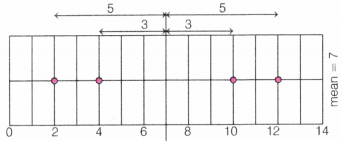
Here, mean = 7
Points below the mean = 2 and 4 and points above the mean = 10 and 12
LHS = 3 + 5 = 8 and RHS = 3 + 5 = 8
So, LHS = RHS
Note There is only one mean value that acts as this perfect balance point. Any other value cannot maintain this balance property.
Effect of Adding or Removing Values on the Mean
- Adding a value greater than the mean, the mean increases.
- Adding a value less than the mean, the mean decreases.
- Adding a value equal to the mean, the mean remains unchanged.
- Removing a value greater than the mean, the mean decreases.
- Removing a value less than the mean, the mean increases.
- Removing a value equal to the mean, the mean remains unchanged.
Properties of Mean
If a constant k is added to every observation, the mean also increases by k.
e.g. The mean of numbers 2, 4 and 6 is 4. Add 3 to each number then numbers become 5, 7 and 9.
∴ New mean = \(\frac{5+7+9}{3}=\frac{21}{3}\) = 7
So, mean increased by 3.
If a constant k is subtracted from every observation, the mean decreases by k.
e.g. The mean of numbers 10,12 and 14 is 12. Subtract 2 from each number then numbers become 8,10 and 12.
∴ New mean = \(\frac{8+10+12}{3}=\frac{30}{3}\) = 10
So, mean decreased by 2.
If every observation is multiplied by a constant k, the mean is also multiplied by k.
e.g. The mean of numbers 3, 5 and 7 is 5. Multiply each number by 2 then numbers become 6,10 and 14.
∴ New mean = \(\frac{6+10+14}{3}=\frac{30}{3}\) = 10
So, mean becomes 2 times the original mean.
If every observation is divided by a non-zero constant k, the mean is also divided by k.
e.g. The mean of numbers 8,12 and 16 is 12. Divide each number by 4 then numbers become 2, 3 and 4.
∴ New mean = \(\frac{2+3+4}{3}=\frac{9}{3}\) = 3
So, mean is divided by 4.
Note:
(i) The sum of the first n natural numbers
(1 + 2 + 3 +….n) is \(\frac{n(n+1)}{2}\)
(ii) The sum of first n natural odd numbers (1 + 3 + 5 +….+ n) is n2.
(iii) The sum of first n natural even numbers (2 + 4 + 6 + 8…) is n (n + 1).
Mean with Frequency
Let x1, x2,… ,xn be n observations with respective frequencies f1, f2,…, fn. This means observation x1 occurs f1, times, x2 occurs f2 times and so on.
Then, sum of the values of all the observations
= f1x1 + f2x2 +…+ fnxn = \(\sum_{i=1}^n f_i x_i\)
Total number of observations = f2 + f2 + ……….+ fn = \(\sum_{i=1}^n f_i\)
Mean (x̄) = \(\frac{\sum_{i=1}^n f_i x_i}{\sum_{i=1}^n f_i}\). It can also be written as x̄ = \(\frac{\Sigma f x}{\Sigma f}\)
Median
Median refers to the value, which lies in the middle of the data, when arranged in an increasing or decreasing order with half of the observations above it and other half below it. e.g. For finding the median of the data 24, 36, 46, 17, 18, 25, 35.
Firstly, data is to be arranged in ascending order i.e. 17, 18, 24, 25, 35, 36, 46.
Since, median is the middle observation, therefore 25 is the median.
Suppose, there are n observations, first arrange the given observations in ascending or descending order.
If n is odd then
∴ Median = Value of \(\left(\frac{n+1}{2}\right)\)th observation
If n is even then
Median = \(\frac{1}{2}\)[Value of (\(\frac{n}{2}\))th and (\(\frac{n}{2}\) + 1)th observation)
![]()
Cumulative Frequency
The frequency of an observation in a data refers to how many times that observation occur in the data. Cumulative frequency of a class is defined as the sum of all frequencies up to the given class.
The cumulative frequency is usually observed by constructing a cumulative frequency table.
Formation of cumulative frequency table can be understood with the help of an example, which is given below.
Method to Find the Median
Firstly, we arrange the data in the ascending or descending order of x, then we find the cumulative frequencies of all the observations.
Let n be the total number of observations (sum of frequencies) then median of the data depends on the number of observations (n).
If n is odd then
Median = Value of\(\frac{n+1}{2}\)th observation
If n is even then
Median = \(\frac{1}{2}\)[Value{(\(\frac{n}{2}\))th + (\(\frac{n}{2}\) + 1)th}observation]
Here, for the value of observation, first look at the cumulative frequency just greater than (and nearest to) the position of required observations. Then, determine the corresponding value of the observation.
Visualising and Interpreting Data
Spreadsheet
- A spreadsheet is a digital tool used to organise, display and analyse numerical data in a systematic way.
- In mathematics, spreadsheets help us store data in tables, perform calculations and represent data visually using graphs and charts.
Structure of a Spreadsheet
A spreadsheet is made up of
- Rows Run horizontally and are numbered
(e.g. 1, 2, 3,…). - Columns Run vertically and are labelled by letters
(e.g. A, B, C, ……………). - Cells The intersection of a row and a column
(e.g. A1, B2 ……………).
Use of Spreadsheets in Mathematics
Tabular Representation of Data Data can be neatly arranged in rows and columns, making it easy to read and compare values.
Performing Calculations Spreadsheets can quickly calculate.
- Sum
- Mean (Average)
- Median
- Maximum and Minimum values
Use of Formulas Spreadsheets allow the use of formulas to automate calculations.
Example formulas
- = A1 + A2 → Adds values
- = AVERAGE(A1:A10) → Finds mean
- =MAX (A1:A10) → Finds maximum
- = MIN(A1:A10) → Finds minimum
This reduces manual calculation errors.
Line Graph
A line graph is a graph, which is used to display data that changes continuously over periods of time.
e.g. A line graph given below shows temperature of a day every four hours. This type of line graph is called ‘time-temperature graph’ based on the following temperature observations taken every four hours.
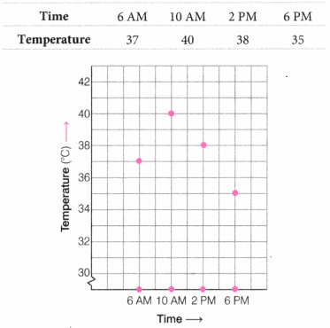
Each observation is shown by a point on the square grid.
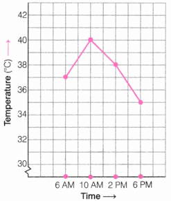
The points are connected by line segments then the result is the line
In the above line graph, horizontal line is called the X-axis, which shows the timing at which the temperature was recorded, whereas the vertical line is called the Y-axis.
From this line graph, the maximum temperature in the day is at 10 AM and the minimum temperature is on the at 6 PM. Also, the temperature increases 3°C (i.e. 37°C-40°C) during the period 6 AM to 10 AM.
![]()
How to Analyse Line Graphs Two-Step Process
Step 1 Identify What is Given
- Observe how the graph is organised.
- Note the scale and units used.
- Identify patterns in the data.
- Look for peaks, troughs and trends.
- Identify which lines represent which data.
Step 2 Infer and Interpret
- Make summary/conclusion statements based on observations.
- Compare different trends.
- Identify cause and effect relationships, when possible.
- Distinguish between actual data vs inferred information.
- Note limitations and missing information.