Class 6 Maths Chapter 4 Data Handling and Presentation Notes
Class 6 Maths Chapter 4 Notes – Class 6 Data Handling and Presentation Notes
Data
Any collection of facts, numbers, measures, observations, or other descriptions of things that convey information about those things is called data.
Collecting Data
Collecting data is information in numbers collected for a specific purpose. To collect the data, we need to make a table and collect it. e.g. If you collect the favorite games in a batch to analyze the most popular game in the batch. We find Sarita likes Hockey, Mamta likes Cricket, Suraj likes Hockey, Sushil likes Football, Udit likes Hockey, Krisha likes Football, Shivay likes Hockey, Rashid likes Hockey, Salman likes Cricket and Shikhar likes Hockey.
| Students | Favourite Games |
| Sarita | Hockey |
| Mamta | Cricket |
| Suraj | Hockey |
| Sushil | Football |
| Udit | Hockey |
| Krisha | Football |
| Shivay | Hockey |
| Rashid | Hockey |
| Salman | Cricket |
| Shikhar | Hockey |
From the above data, we conclude that the most popular game in the batch is Hockey.
Organisation of Data
The data that is collected for the first time is called raw data or ungrouped data. When the data is arranged in any data it becomes grouped data. When the data is very large, it is difficult to arrange them in a grouped form. In this case, small bars are used to represent data; such a method is called the tally method. To get the required information, all observations should be recorded. We depict each observation with the help of tally marks. Tally marks are used to organize the observations. Record every observation by a vertical mark, but every fifth observation should be recorded by a mark across the four earlier marks. The fifth observation tally mark looks like this ![]() .
.
Example 1.
In a class test, the following marks were obtained in the unit test of algebra by 35 students. Arrange these marks in a table using tally marks.

(i) Find how many students obtained marks equal to or less than 5.
(ii) How many students obtained marks above 6?
Solution:
The table with tally marks is shown below.
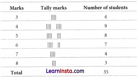
(i) Here, we have to find out the students, who obtained marks equal to or less than 5.
So, we have to add the number of students who obtained marks equal to 5 or less than 5.
i.e. marks 3, 4, and 5.
∴ Number of students = 4 + 9 + 8 = 21
Hence, 21 students obtained marks equal to or less than 5.
(ii) Here, we have to find out the students who obtained marks above 6.
So, we have to add the number of students who obtained marks above 6.
i.e. marks 7 and 8.
∴ Number of students = 4 + 3 = 7
Hence, 7 students obtained marks above 6.
![]()
Example 2.
In a shop, different sizes of shoes are sold in a week as shown below:
7, 9, 10, 8, 7, 9, 7, 9, 6, 3, 5, 5, 7, 10, 7, 8, 7, 9, 6, 7, 6, 7, 10, 5, 4, 3, 5, 7, 8, 7, 9, 7.
Arrange the above data in ascending order and construct a table using tally marks.
Also, answer the following questions.
(i) Which shoe size had the maximum sale?
(ii) Which shoe size had the minimum sale?
(iii) Find the number of shoes sold in size 7 or greater than 7.
Solution:
The ascending order of the given data is 3, 3, 4, 5, 5, 5, 5, 6, 6, 6, 7, 7, 7, 7, 7, 7,7, 7, 7, 7, 7, 8, 8, 8, 9, 9, 9, 9, 9, 10, 10, 10.
The table with tally marks is given below.
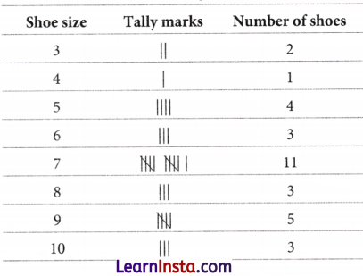
(i) Here, the shoe size had the maximum sale = 7
(ii) Here, the shoe size had the minimum sale = 4
(iii) Here, we have to find out the number of shoes sold in size 7 or greater than 7.
So, we have to add several shoes sold in size 7 or greater than 7 i.e., sizes 7, 8, 9, and 10.
∴ Required number of shoes = 11 + 3 + 5 + 3 = 22
Hence, 22 shoes sold of size of 7 or greater than 7.
Example Problems
Question 1.
The following data shows the favorite sport of a group of students in class VI.
Hockey, Cricket, Football, Badminton, Basketball, Cricket, Football, Cricket, Football, Basketball, Cricket, Hockey, Cricket.
Answer the following questions.
(i) What is the most popular game in the group?
(ii) Try to find out the least popular game in the group.
Answer:
(i) Cricket
(ii) Badminton
Question 2.
The following data shows the choice of sweets for 30 students of Class VI.
Laddoo, Barfi, Laddoo, Jalebi, Laddoo, Rasgulla, Jalebi, Laddoo, Barfi, Rasgulla, Laddoo, Jalebi, Jalebi, Rasgulla, Laddoo, Rasgulla, Jalebi, Laddoo, Rasgulla, Laddoo, Laddoo, Barfi,, Rasgulla, Rasgulla, Jalebi, Rasgulla, Laddoo, Rasgulla, Jalebi and Laddoo.
Answer the following questions.
(i) Which sweet is preferred by most of the students?
(ii) Which sweet is preferred by the least of the students?
(iii) How many students like Rasgulla Sweet?
Answer:
(i) Laddoo
(ii) Barfi
(iii) 9
Question 3.
The following data shows the favorite sport of the students of class VI.
Basketball, Football, Football, Hockey, Football, Hockey, Cricket, Football, Cricket, Football, Football, Football, Basketball, Football, Hockey, Football, Hockey, Football, Hockey, Basketball, Basketball, Football, Cricket, Hockey, Hockey, Basketball, Basketball, Basketball, Basketball, Basketball.
Answer the following questions.
(i) Arrange the name of the game in a table using tally marks.
(ii) Try to find out the most popular game in the class.
Answer:
(i) The table with tally marks is shown below.
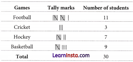
(ii) Football
Question 4.
In a mathematics test, the following marks were obtained by 37 students. Arrange these marks in a table using tally marks.
8, 1, 3, 7, 6, 5, 5, 4, 4, 2, 4, 5, 3, 7, 1, 6, 5, 2, 7, 7, 3, 8, 4, 2, 8, 5, 8, 6, 7, 4, 5, 6, 6, 4, 4, 6 and 6.
(i) How many students obtained marks equal to or more than 7?
(ii) How many students obtained mark below 3.
Answer:
(i) 9
(ii) 5
Question 5.
Sarita threw a dice 40 times and noted the number appearing each time. She put a tally mark ‘I’ for each number that appeared on a throw and when the count reached 5, She put a line through the previous four and marked it as ![]() .
.
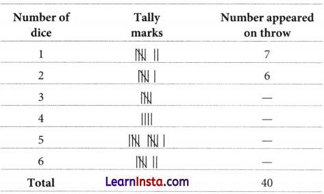
Complete the table and fill in the blank given below.
(i) The number which appeared a minimum number of times is ___________
(ii) The number which appeared a maximum number of times is ___________
(iii) Number 1 and number ___________ appeared on equal times.
Answer:
(i) 4
(ii) 5
(iii) 6
Pictographs
Pictographs are a nice visual and suggestive way to represent the data using pictures of objects (i.e. without writing any numbers). It helps us to answer the questions on the data at a glance. In the interpretation of a pictograph, the first step is to know what it represents or what information is given by it. It is also important to know the number of units represented by one picture symbol.
Example 1.
The following pictograph represents some surnames of people listed in the telephone directory of a city.
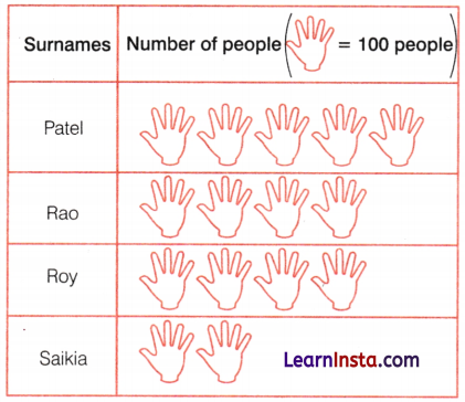
Observe the above pictograph and answer the following questions.
(i) How many people have the surname Roy?
(ii) Which surname appears the maximum number of times in the telephone directory?
(iii) Which surname appears the least number of times in the telephone directory?
(iv) Which two surnames appear an equal number of times?
Solution:
(i) In the table, there are 4 pictures of Roy’s surname.
∴ 4 pictures = 4 × 100 = 400 people
Hence, the number of people having the surname Roy is 400.
(ii) Surname Patel appears a maximum number of times. Because according to the given pictograph, it has a maximum number of picture symbols.
(iii) The surname Saikia appears the least number of times. Because according to the given pictograph, it has a minimum number of picture symbols.
(iv) The surnames Rao and Roy appear an equal number of times. Because according to the given pictograph, picture symbols in both surnames are equal.
![]()
Example 2.
The colours of cars preferred by people living in a society are shown in the following pictograph.
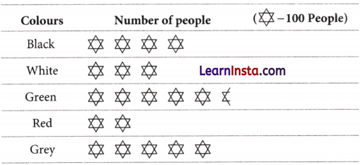
Look at this and answer the following questions.
(i) Find the number of people preferring white colour.
(ii) How many people liked the green colour?
(iii) Find the sum of some people who prefer black and red colour.
Solution:
(i) White colour is preferred by 300 people.
[∵ ![]() = 100, so 3 pictures indicate 3 × 100 people]
= 100, so 3 pictures indicate 3 × 100 people]
(ii) For 5 complete pictures, we get 5 × 100 = 500 people, and for 1 incomplete picture, we may roughly take it as 50 people.
Hence, the number of people who prefer green colour is nearly 550.
(iii) We have to find the sum of the number of people who prefer black and red colour. So, we have to add the number of people who prefer black and red colour.
Now, the number of people who prefer black colour = 4 × 100 = 400 people
and the number of people who prefer red colour = 2 × 100 = 200 people
∴ The sum of the number of people who prefer black and red colour = 400 + 200 = 600 people
Hence, 600 people prefer the black and red colour.
Drawing a Pictograph
To represent any data in the form of a pictograph, we follow the following steps:
- Collect Data: Collect the data of the different categories we want to represent. We then form a table or list.
- Review that data and pick a symbol: Review the collected data and based on it pick a symbol or picture that accurately represents the data.
- Assign a scale or key: Based on the frequency of the data, decide the frequency for one symbol. This can be done by setting a numerical value that one symbol will represent.
- Draw the pictograph: Finally, draw the pictograph by initially drawing two columns that represent the category and the data.
Example 3.
One day, Shivangi collected data on how many students were absent in each class. Data is given below.

Draw a pictograph for the above data.
Solution:
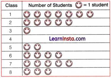
Hence, we used one symbol ![]() for each student.
for each student.
Example 4.
A Survey was carried out in a certain school to find out the different modes of transport used by students to travel to school each day. The obtained data is given below.

Observe the above data and answer the following questions.
(i) Draw a pictograph for the given data.
(ii) Which is the most popular mode of transport?
(iii) Which mode of transport is least used by the students?
Solution:
(i) The required pictograph for the given data is shown below.
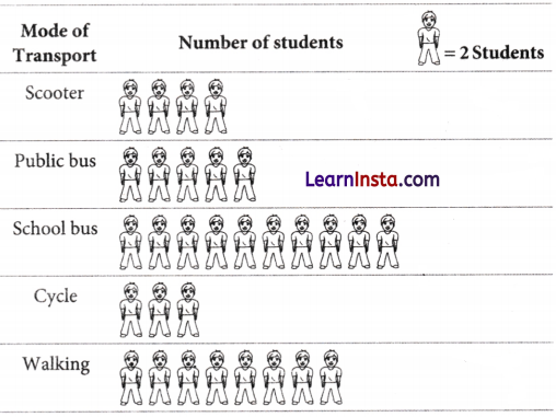
(ii) Maximum number of students using the school bus. Therefore, this is the most popular mode of transport.
(iii) Cycle is used only by six students. Therefore, this mode of transport is least used by the students.
Example Problems
Question 1.
The following pictograph shows the number of government employees in five villages.
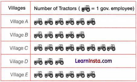
Observe the above pictograph and answer the following questions.
(i) Which village has the minimum number of government employees?
(ii) Try to find out the number of government employees in village D.
(iii) What is the total number of government employees in all five villages?
Answer:
(i) Village D
(ii) 3
(iii) 28
Question 2.
The following pictograph shows the number of present students on different days of the week in a school.
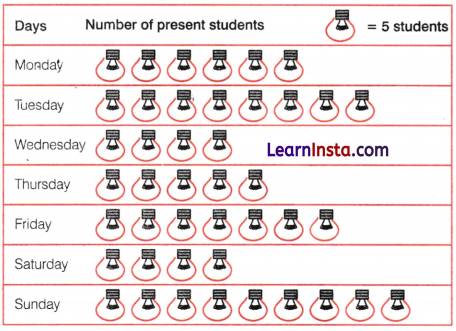
Observe the above pictograph and answer the following questions.
(i) How many students were present on Friday?
(ii) On which of the days, the number of students present was the same?
(iii) On which day was the maximum number of students present?
Answer:
(i) 35
(ii) Wednesday and Saturday
(iii) Sunday
Question 3.
One day Anshika collected data on how many girls, and students were in each class of her school. The collected data is given below.

(i) Draw a pictograph for the above given data.
(ii) How many girls are students in class VI?
(iii) Which class has the minimum number of girls students?
Answer:
(i)
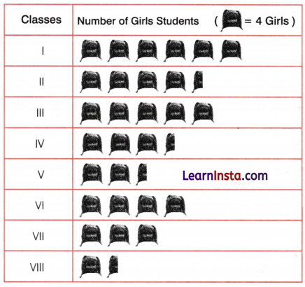
(ii) 16
(iii) Class VIII
![]()
Bar Graphs
The graphical representation of data using bars of uniform width drawn vertically or horizontally with different lengths is called as bar graph. It makes it easy for the viewers to compare different values and draw conclusions quickly.
Example 1.
The bar graph (given below) shows the population of India in each decade over a period of 50 years.
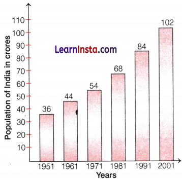
Observe the above bar graph and answer the following questions.
(i) What was the population of India in 1991?
(ii) How much did the population of India increase over 50 years?
Solution:
(i) From the given bar graph, it is clear that the population of India in 1991 was 84 crores.
(ii) From the given bar graph, we have the population of India in 1991 = 36 crores and the population of India in 2001 (after 50 years) = 102 crores
Hence, 102 – 36 = 66 crores population of India increase over 50 years.
Drawing a Bar Graph
For drawing a bar graph of any data, first, we draw a horizontal line and a vertical line. On the horizontal line, we will write the name of the object, equally spaced, from which the bar will rise following their frequencies, and on the vertical line, we will write the frequencies representing the number of objects. We must choose a scale.
Choosing a Scale
To draw a bar graph, an appropriate scale needs to be chosen.
e.g. In a bar graph, where numbers in units are to be shown, the graph represents one unit length for one observation, and if it has to show ten or hundred numbers, one unit length can represent 10 or 100 observations.
Example 2.
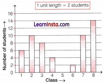
One day Jay collected data on how many students were absent in each class. Data is given below.

Draw a bar graph for the above data.
Solution:
First, we draw a horizontal line and a vertical line. On the horizontal line, we will write the number of each of the classes equally spaced, and on the vertical line, we will write the frequencies representing the number of students. The required bar graph of the number of students in each class is
Example 3.
In a school, there are five sections of Class VII. The number of students in each section is given below.

Represent the above data on a bar graph and answer the following questions.
(i) In which section, are the students are highest, and in which section, are the students are least?
(ii) How many sections are there in all? What are they?
Solution:
Choosing a suitable scale is as follows.
Start the scale at 0. The greatest value in the data is 44, so end the scale at a value greater than or equal to 44.
Use equal divisions along the axes, such as increments of 4.
We choose the scale such that the length 0 and 44 is neither too long nor too small.
Here, we take 1 unit for 4 students. Then, draw and label the graph as shown.
Scale 1 unit = 4 students.

From the bar graph, we can say that
(i) In Section B, some students are the highest, and in Section E, some students are the least.
(ii) There are five sections. These sections are A, B, C, D, and E (these are observed on the horizontal line).
Artistic and Aesthetic Considerations
Artistic and aesthetic considerations are the collection of stylistic choices an artist uses to make an object interesting and effective or to communicate meaning, value or emotion to the observer. When making a visual presentation of data such as a pictograph or bar graph, it is important to make it fit in the intended space, which can be controlled.
e.g. By choosing the scale appropriately.
Example 4.
The table given below shows the 5 highest peaks in India, along with the height of each peak in meters.

Draw bar graph for above data.
How much taller is peak K2 than peak Saltoro Kangri?
Are peak Nanda Devi and peak Kamet very different in height? How can describe it easily?
Solution:
Here, it is not so easy to immediately recognise it from a large table of numbers.
We can convert the table of numbers into a bar graph as shown below.
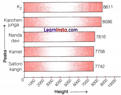
Here, each value is drawn as a horizontal box. These are longer or shorter depending on the numbers they represent. This makes it easier to compare the heights of all these peaks at a glance. However, since the boxes represent heights, it is better and more visually appealing to rotate the picture so that the boxes grow upward vertically from the ground like peaks. A bar graph with vertical bars is also called a column graph. Below is a column graph for the given table of the highest peak.
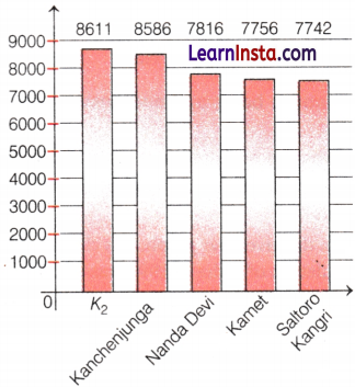
From the above column graph, it is easily clear that 8611 – 7742 = 869 m taller peak K2 than peak Saltoro Kangri, and there is a very small difference in height of the peak of Nanda Devi and peak Kamet i.e. 7816 – 7756 = 60 m
Example Problems
Question 1.
The following bar graph shows the favorite color of 200 kids in a class.
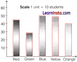
Observe the above bar graph and answer the following questions.
(i) Which colour is the most preferred?
(ii) Which colour is the least preferred?
(iii) How many kids chose blue as their favorite color?
(iv) How many kids chose orange as their favorite color?
Answer:
(i) Blue
(ii) Green
(iii) 50
(iv) 40
![]()
Question 2.
The following bar graph shows the different types of pets owned by the students of class VI.
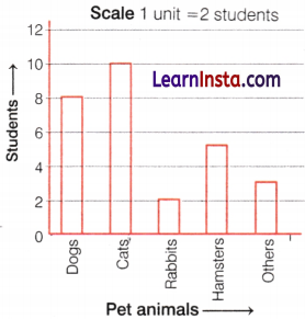
Observe the above bar graph and answer the following questions.
(i) Which is the least popular pet?
(ii) How many students have a dog as a pet?
(iii) How many students have a rabbit as a pet?
Answer:
(i) Rabbit
(ii) 8
(iii) 2
Question 3.
One day Satyam noted the data on how many books were sold by his bookstore for five consecutive years. Data collected by Satyam is given below.

(i) Draw a bar graph for the data collected by Satyam.
(ii) How many books were sold in 2021?
(iii) In which year fewer than 250 books were sold?
(iv) Why do you think that the number of books sold in 2019 is less than the number of books sold in 2023?
Answer:
(i)
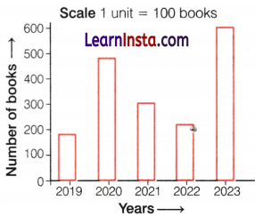
(ii) 300
(iii) In the years 2019 and 2022, fewer than 250 books were sold.
(iv) From the graph, it is clear that the height of the rectangle in the year 2019 is less than the height of the rectangle in the year 2023.
Question 4.
The following bar graph shows the performance of a student in five subjects.
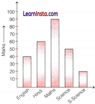
Look at the above bar graph and answer the following questions.
(i) In which subject the student’s performance is the best?
(ii) How many marks did the student in the Maths subject?
(iii) What do you think is so little difference in the performance of students in subjects Hindi and Science compared to the other two subjects?
Answer:
(i) Maths
(ii) 90
(iii) It is clear from the graph that there is very little difference in the height of bars of Hindi and Science subjects compared to any other two bars.
→ A data is a collection of facts, numbers, measures, observations, or other descriptions of things to give some information.
→ We usually use tally marks for recording and organizing the data. Data can also be represented pictorially or graphically.
→ A pictograph is a diagrammatic representation of data. It represents data in the form of pictures of objects or parts of objects.
→ Pictographs help in answering the questions on the data at a glance. If the data is presented as columns (or bars) on a graph, then the graphical representation of data is called a bar graph. These bars are of uniform width, drawn horizontally or vertically with equal spacing between them.
→ A collection of numbers (values) gathered to give some information is called data.
→ The word ‘data’ is the plural form. However, it is used as if it is a singular noun. The singular form of data is “datum”.
![]()
→ There are two types of data:
- primary data and
- secondary data.
→ If the data is collected directly from the source, it is called primary data. When data is collected from secondary sources (such as newspapers, magazines, television, the internet, etc.), then it is called secondary data.
→ Data can be arranged in tabular form using tally marks.
→ A pictograph represents data in the form of pictures of objects or parts of objects. Pictographs help us in getting information from the data at a glance.
→ In a pictograph, each picture represents a frequency which may be either 1 or more than 1. This is known as scale. The scale must be specified in a pictograph.
→ In a bar graph, the bars (rectangles) of uniform width are erected horizontally or vertically with equal spacing between them. The scale used to convert length or height to frequency must be specified in a bar graph.
→ In a bar graph, the heights (or lengths) of the bars represent the given number.
→ Tally marks are used for recording and organization of data. | represents 1, || represents 2, ||| represents 3, |||| represents 4, ![]() represents 5,
represents 5, ![]() represents 6, and so on.
represents 6, and so on.